Tuesday, 10 January 2017
Evaluation 2 - Evidence
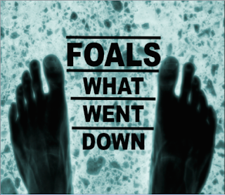
The above screenshots is my evidence which shows the colour scheme, themes and images which I included within my Digi Pak design as well as my album cover in order to help create synergy and allow my audience to make and see clear links between each of my products.
This is my magazine article which I created and I felt that it was important to use a recognisable image which came from my digi pak design and I felt that the audience would be able to make clear links between my products by seeing the repetitive 'x ray' colour theme and they would be able to associate this with my music video.
Subscribe to:
Comments (Atom)


